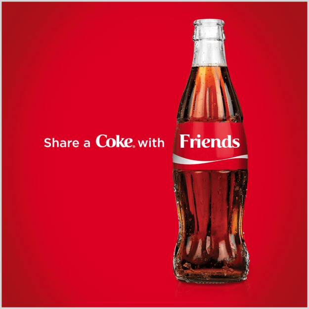
Coca-Cola has been known for really fun ads and advertising campaigns. They’ve gotten really good with clean ads and are really good at using typography. For example the ad above is clean and simple just the five words “Share a Coke with Friends.”
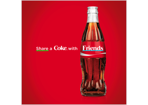
So lets talk about the typography the used in this ad. I first underlined the word “Share” they used a Sans Serif font for this. You can tell because there are no Serifs and no thin to thick transitions. The second word I underlined was “Friends.” They used an Old-style font for this you can tell because they have curved serifs. This creates a really fun ad to look at because you start by reading “Share a Coke with” leading you to the word Friends and the Coke bottle itself leading you to the product. They also used their logo design on the word “Coke” so you know what company it is you’re looking at if you couldn’t tell from the bottle.
This design overall is really good. It’s clean and simple and I love how it guides you through the image towards the product itself.
I found the image from https://www.jeffbullas.com/7-smoking-hot-changes-coming-to-content-marketing/coca-cola-advertisement/
