This assignment we were tasked to take our radio ad and make it a Tv ad. To do this we took a slow motion shot of the coca-cola bottle. The final shot was a slow motion shot of me drinking a coke. After the shots were recorded we took the radio ad and added it onto the videos.
All posts by paytonkauffold4
Adding audio to video
Today we had to take a silent film and add audio to it. The video I chose was an old film about a guy throwing dough at a rat. To get the sound of the dough we used crescent roll dough and threw it in a bowl. For the music it was a recording of a piece I played in band. The final sound was someone falling out of a chair. We took these sounds and lined them up to where it would happen in the video.
Camera angles
there are a lot of different camera angle that are used and these are my five favorite.
- high angle
a high angle is where the photo is taken above eye level to make the items in the photo seem small and weak and far away. I like how you can see a large area using this angle
2. eye level
eye level is where the photo is taken when the camera is at approximate eye level this gives a natural affect on the audience because its what they are used to seeing the world as.
3. close-up
this where you take a close picture of the subjects face. this allows you to be able to see their emotion at a greater detail.
4. Medium long shot
This is a nice camera angle because it allows you to see almost all of the person in the frame and a little bit of the area around them.
5. medium close-up
this is similar to a close up where you can see the person in the images emotions well but it also gives a little glimpse of the area around them and a better look at what they are wearing.
Coca-Cola radio ad
Today we were asked to make a radio ad, my favorite drink is coca-cola so I decided it would be fun to make an ad about coke. The second voice in the ad is my brother.
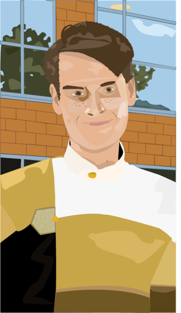
digital media contest
for this contest I chose the vector graphics and for that I’m submitting my self portrait I created in illustrator. I was very happy on how it turned out, everything form the shades and highlights on the face and the little details in the eyes really made it in my opinion look pretty good.
Motion is everything
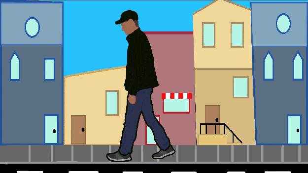
Today as a class we were asked to take our walking animation and add motion tweens to make a background. Using animate I drew the side walk and clouds in the background and made them into motion tweens. I then decided for me I could make buildings faster in illustrator so I headed over to that program and made the buildings for the background and added them into my animation. Making the buildings tween a little longer than the sidewalk it gave me the speed at which I wanted the background to move along with my walking animation. I’m pleased with the out come of this it really adds extra character to the walking animation.
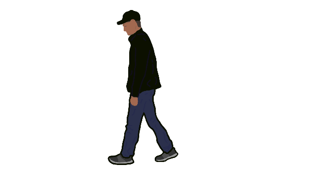
Animation Walking
Animation is a long process but it’s worth it in the end. The hardest thing about animating is drawing similar pictures over and over with slight differences to make it seem what you are creating is moving the way you want it to. To really test what we can we were assigned the task of recording ourselves and the animating ourselves walking. I went for a more simple style with very little facial details. What I focused the most on was the way my clothes moved as they walked, this is where I wanted the most movement from (besides the walking itself). This process of drawing each detail of myself took about four days of class work time so about five and a half hours, I’m very pleased with the outcome.
Movies are awesome
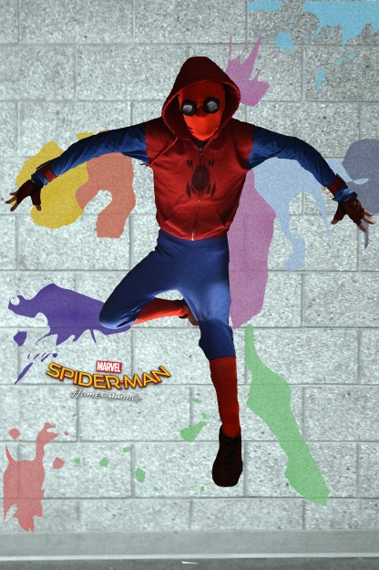
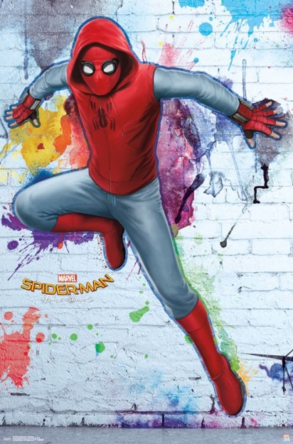
We were given as a class the task to find a movie poster and recreate it with our own pictures. I decided it would be fun to do a Spider-man homecoming poster because I already had the suit from the movie. So to start I took pictures of myself lying down on the ground and once I had the picture I brought them into Photoshop added a layer mask and removed the background. I then took the original image over to illustrator and made both the logo and the paint splatters. I then found a wall in my school and took a couple of pictures to find the right one. Once I put the image of me in the suit on the wall it looked kind of off so using some of the other pictures I had taken I took the legs and hands from them and applied it to the main picture making it look closer to the actual poster. This assignment really pushed my skills into seeing what I could do using both of these programs to make a picture that I feel turned out pretty amazing.
Boundaries are constrictions
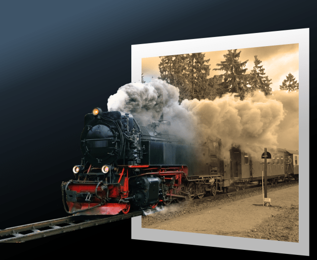
This was a really fun interesting project, as a class we were assigned to make a train look like its coming out of an image. To do this we started by making a rectangle shape and changing the prospective of it. After we had done that we added the train into the image and removed everything outside of the left of the train. we then removed everything in front of the rectangle on the right side and removed the ground in between the rails. We then clipped the train image to the rectangle and changed the color inside the rectangle. After that we masked it and made it so the train looks like its popping out of the old photograph. We finished by adding another rectangle and added other effects to make the finished project look even better.
I loved this assignment because it showed my that you can really think outside of the box when designing something. Making it look like the train is popping out of the image shows that I can make anything pop out of something in a really cool way.
Space is cool
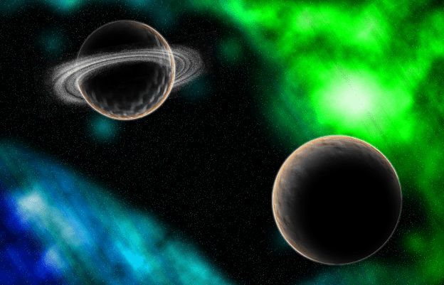
So this time as a class we had some fun designing an image of space. To do this we used many different techniques like adding noise to a background to add the stars. After we added all the stars we then set up a gradient background and made it so we could erase it and make a really cool nebula looking design. After the nebula’s were made we got to design the planets. This was a very fun process, but before we started putting them into Photoshop I had to take pictures of textures for the planet. The first one I took was of my desk and the other one was of someones pants leg. I then put those pictures into Photoshop and we used many different techniques to make them. We started but inserting the textures and converting the shape into a sphere. I then added some outside highlights to the planet and added a shadow. I repeated the same process for the second planet. to make the ring around the second planet we used the same process for the stars but converted it into a swirl, removed some of the outside parts and the center and collapsed it so it looked more like a ring.
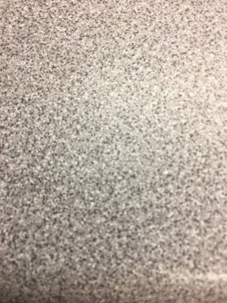
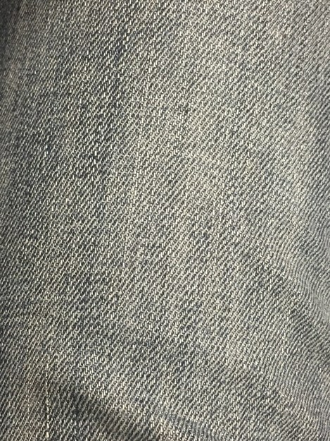
showed above are the textures i used to make the two planets.
