All posts by paytonkauffold4

Photography

Today we as a class was tasked to find professional photos and find ones that had rule of thirds, leading lines, and depth of field.

https://www.provideocoalition.com/rule-thirdsi18th-century-invention/ Jose Antunes

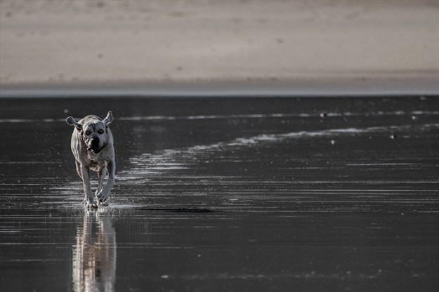
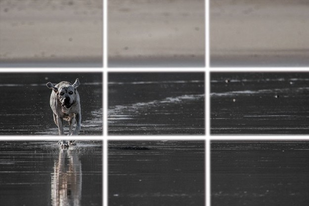
The first image I found was of a dog running across a wet beach. This is my example I found of the rule of thirds. What the rule of thirds is, is where an image is split into nine different squares. The top three are where the horizon is the middle three is usually where the focus of the image is, and the bottom three is where the ground usually is. In the image with the dog the horizon is on the top three. The dog is on the left side of the middle three becoming the focus of the image.

https://mashable.com/2013/08/01/leading-lines-photo-challenge/

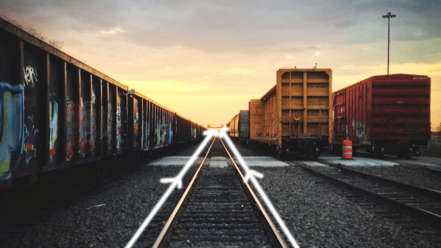
Next up I found a nice picture of a railway that shows leading lines really well. What leading lines are is where a technique where the photo naturally draws your eyes down the photo to lead to the main subject of the image. In this photo of the railway the main subject is the sunrise being pointed to by the railway itself.

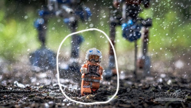
These Awesome LEGO Star Wars Photos Look Like They’ve Come Out of a Movie

Next up is depth of field, this is a technique where the main subject of the image is the only thing in focus. So the rest of the image is blury but you can still get the main idea of what’s behind the main object of the image. So the example I found is of a Lego Star Wars character running away from the Lego Empires robot walkers.

My Logo

This past week and a half I was tasked with designing a logo for myself in my digital media class. Some background before I explain the process of the logo I want to give a little background on me because it will explain the logo better. I love music, I always have, whether it be listening or playing it music has been a really big part of my life.

So since I love music so much I decided to put it into my logo for me. So I started drawing and designing. In the top left I thought it would look pretty cool if I put my initials inside my instrument. I didn’t really like the design and I couldn’t find a good way to make it work. This is where I had the idea to keep my initials to represent me and add music notes. I started with the two quarter notes and sixteenth notes and kind of had the scattered. I then added the treble clef and thought it would be pretty cool if I had the stem looping through the “P”. I was later given the idea to have the sixteenth note go around my “W” this made me decided to put the measure lines around my initials and the notes. I did this because I wanted to show how music surrounds me and my life, and the music notes show how intertwined I truly am with music. This was a fun assignment to work on and I’m super happy with the results.

Self Portrait

In my digital media class we were as a class tasked with an assignment to make a self portrait of ourselves using only the pen tool on illustrator.

The first picture is the picture I used as a reference and the bottom picture is my finished self portrait. The very first thing I did was create my head shape. To do this I outlined the entirety of my face except my ears because I’ll make those in a different layer later on. So as I was making the face by the time I got down to the neck to make sure when I did the uniform later on I made my neck shape much longer than it should be so the uniform would fit nicely over it. After I finished the face shape I moved onto the nose, I made a new layer titled it nose and made sure it was on top of my face layer. To do the nose I had to make multiple smaller shapes instead of one giant shape like my face is. The reason for this is the nose is very complex and one shape would look weird and out of place. After finishing the nose I went on to the eyes. I started with the general shape of my iris and pupils to do the pupils I had to add what’s called a catch light. It’s a reflection of light that happens in our pupils and without our eyes look very flat and dead. The whites of the eyes also can’t be a plain bright light or it looks unnatural and freaky. After finishing the irises I moved on the the eye lids and the shadows around my eyes. The eyelids were easy to put on it was a couple quick shapes around the eyes I just finished making. The shadows and highlights were more difficult because I had to understand how light was hitting that certain area. This applied for the entire piece. After finishing the eyes I moved on to the part that scared me the most. The hair and eyebrows, I decided to get the eyebrows out of the way first because they were smaller. To do the eyebrows I did one solid shape than in the inside of that shape added a smaller more rugged shape to make it look like hair. I did a similar approach to the rest of my hair by making three main shapes the top of my hair and the two sides. After making these I went around it again making another more rugged shape and making sure it was placed under the main three shapes to make it look more natural and less flat. After that I added some highlights and shadows to it in the direction I part my hair. At this point I had finished my main face the only thing I had left was the uniform. I did this by making shapes for the main colors so the black, yellow, and the white. After that I went in and added the neck of the uniform and made it a different shade of white so it didn’t blend in with the rest of the white. I added shadows here and there and to make the area near the button added a shape where it was supposed to go and on the uniform that area is sparkly so I added a bunch of little sparkle shapes and placed them onto it. At that point I had finished my portrait but I wanted to add a little more so I added the background following everything I did with my main body, by adding shapes and then highlights and shadows.

Coca-Cola Typography Ad

Coca-Cola has been known for really fun ads and advertising campaigns. They’ve gotten really good with clean ads and are really good at using typography. For example the ad above is clean and simple just the five words “Share a Coke with Friends.”

So lets talk about the typography the used in this ad. I first underlined the word “Share” they used a Sans Serif font for this. You can tell because there are no Serifs and no thin to thick transitions. The second word I underlined was “Friends.” They used an Old-style font for this you can tell because they have curved serifs. This creates a really fun ad to look at because you start by reading “Share a Coke with” leading you to the word Friends and the Coke bottle itself leading you to the product. They also used their logo design on the word “Coke” so you know what company it is you’re looking at if you couldn’t tell from the bottle.

This design overall is really good. It’s clean and simple and I love how it guides you through the image towards the product itself.

I found the image from https://www.jeffbullas.com/7-smoking-hot-changes-coming-to-content-marketing/coca-cola-advertisement/

About me

Hello! My name is Payton Kauffold, this is my new website where I’ll be posting some graphic design projects through out this next year. Some things about me, I have 3 siblings, an older brother who’s living on his own, an older sister who is at college right now, and a younger brother who just started his sophomore year at Davis High School.

I’ve been apart of my school’s bands since seventh grade. I started as a trumpet player for my first three years and auditioned to be apart of the Davis High School Marching Band in my ninth grade year and made it. Near the end of my sophomore year I decided to extend my reach of musical instruments and started playing the Baritone. I’m a geek and love many different types of fiction. In the picture above I’m wearing a Hufflepuff scarf from Harry Potter. I’m also a big fan of many different video games my favorite game series has to be The Legend of Zelda because it was the games I grew up on.